
Personal Branding for Penelope Featherington from Netflix’s Bridgerton
April 14, 2022
This week we’re paying a tribute to Penelope Featherington from the Netflix show, Bridgerton.
*Heads Up: If you haven’t seen season 1 of Bridgerton, there may be spoilers ahead!*
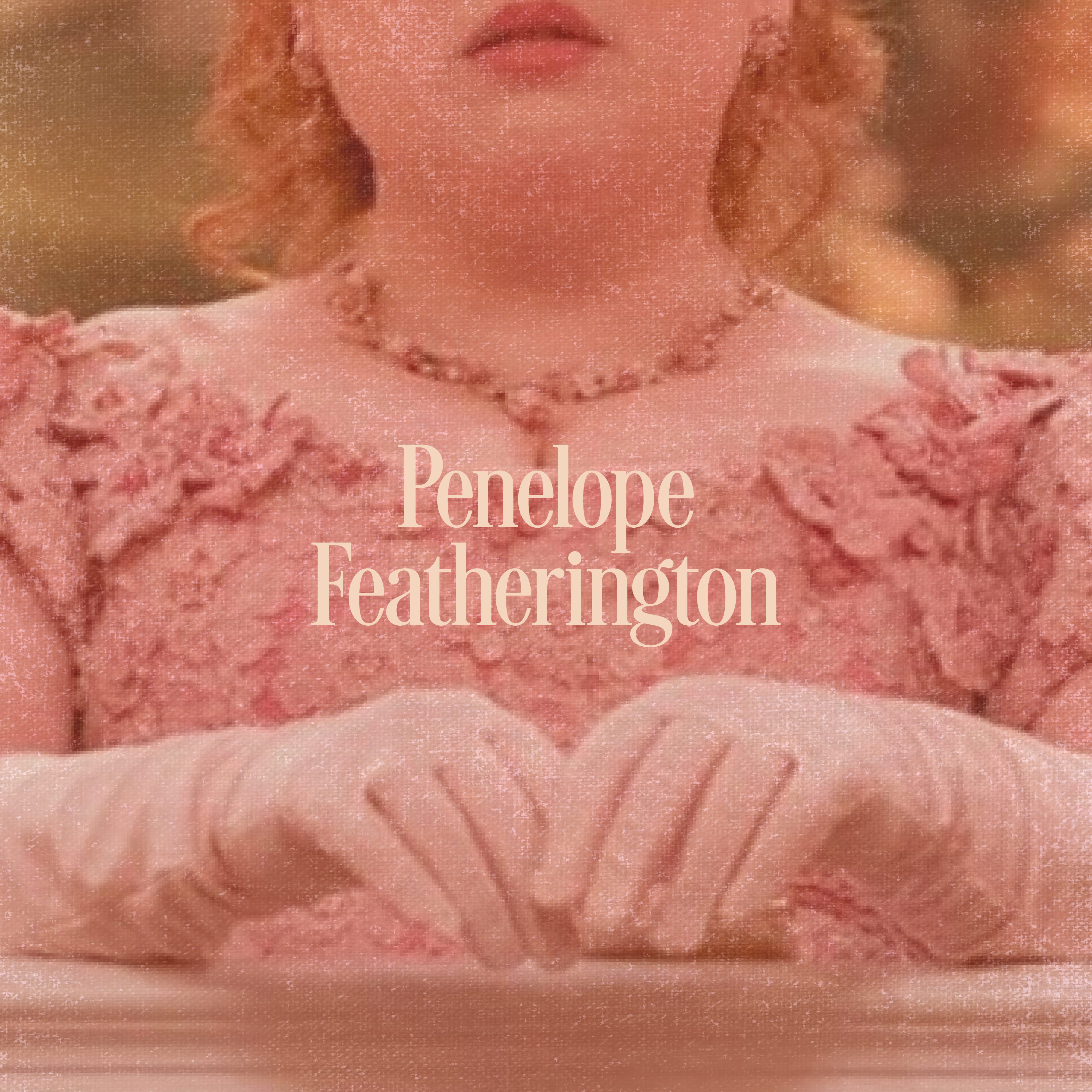
Just like I did with the first season, I recently binged Bridgerton season 2 in a day and a half. This season was different than the previous one with what I felt like was more focus on subplots. One character that really stood out to me this season was Penelope Featherington, also known as the secret Lady Whistledown.
I absolutely love Penelope and how witty and bubbly she is. Of course she isn’t without flaws, as we saw with Eloise, but I think that makes her that much more loveable. I also love how her mother (who the show costume designer says is from “new money”) dresses her in bright colors like yellow, pink and orange. This is cooly contrasted with the Bridgerton family, who all dress in less saturated shades of blue and purple.
I love the colors she wears and who she is as a person, so I decided Miss Penelope Featherington would be a fun Bridgerton character to design a personal brand for.
Penelope Featherington Mood Board
I started with Penelope’s mood board to grab colors get an underlying sense of her as a character. I focused on on these keywords:
- Sweet
- Bright
- Warm
- Witty
- Bubbly
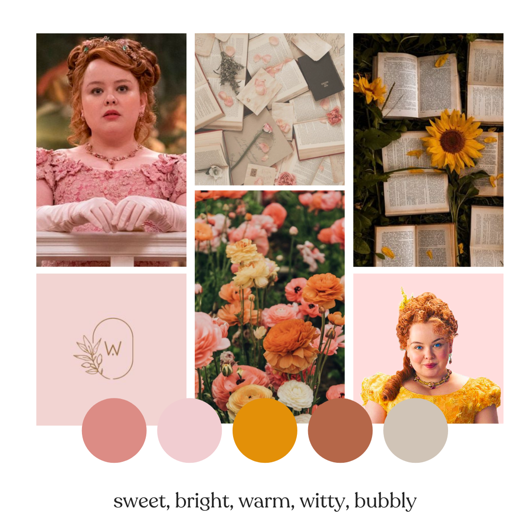
I included flowers and Penelope’s love of words throughout.
Penelope Featherington’s Brand Colors

I ended up with this color palette for Penelope. Notice that although she wears pretty bright colors, she does lament throughout the show that she dislikes them (for example, she tells Edwina she hates her yellow dress). So although she does wear yellow a lot, I didn’t end up including it in her palette. I focused on pinks and earthier colors as I think she is a true romantic (can’t wait for Polin’s season!) and she is more grounded than the other characters give her credit for.
Also side note: it’s ironic that she wears yellow because yellow did symbolize luxury back in the Regency days–but it comes off as somewhat tacky on the show. This is intentional from the costume designer!
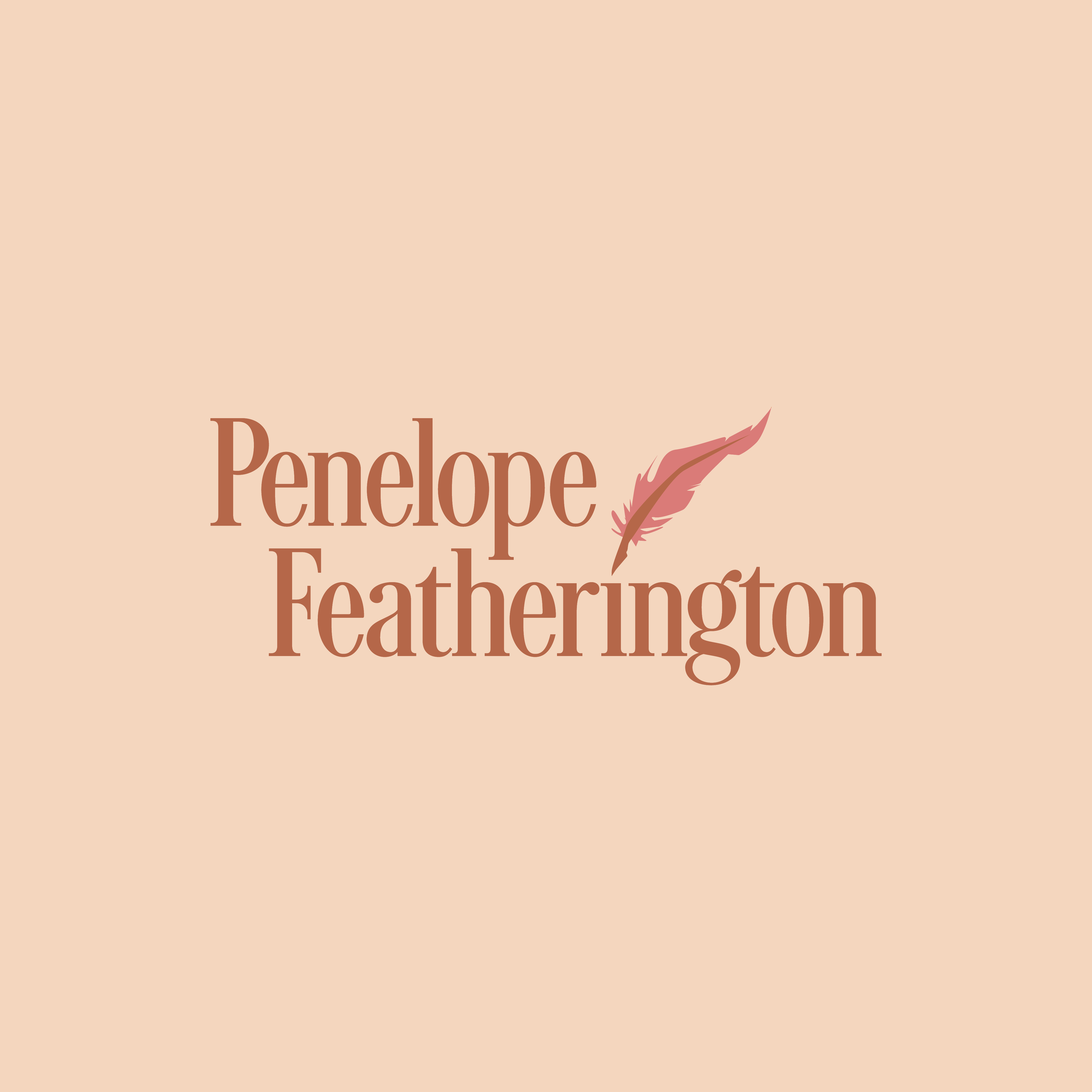
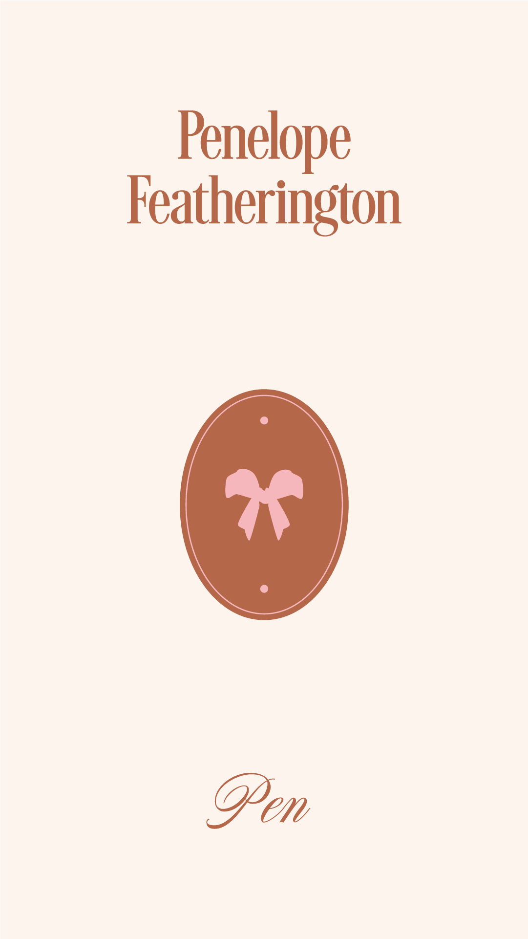
Penelope Featherington Logo
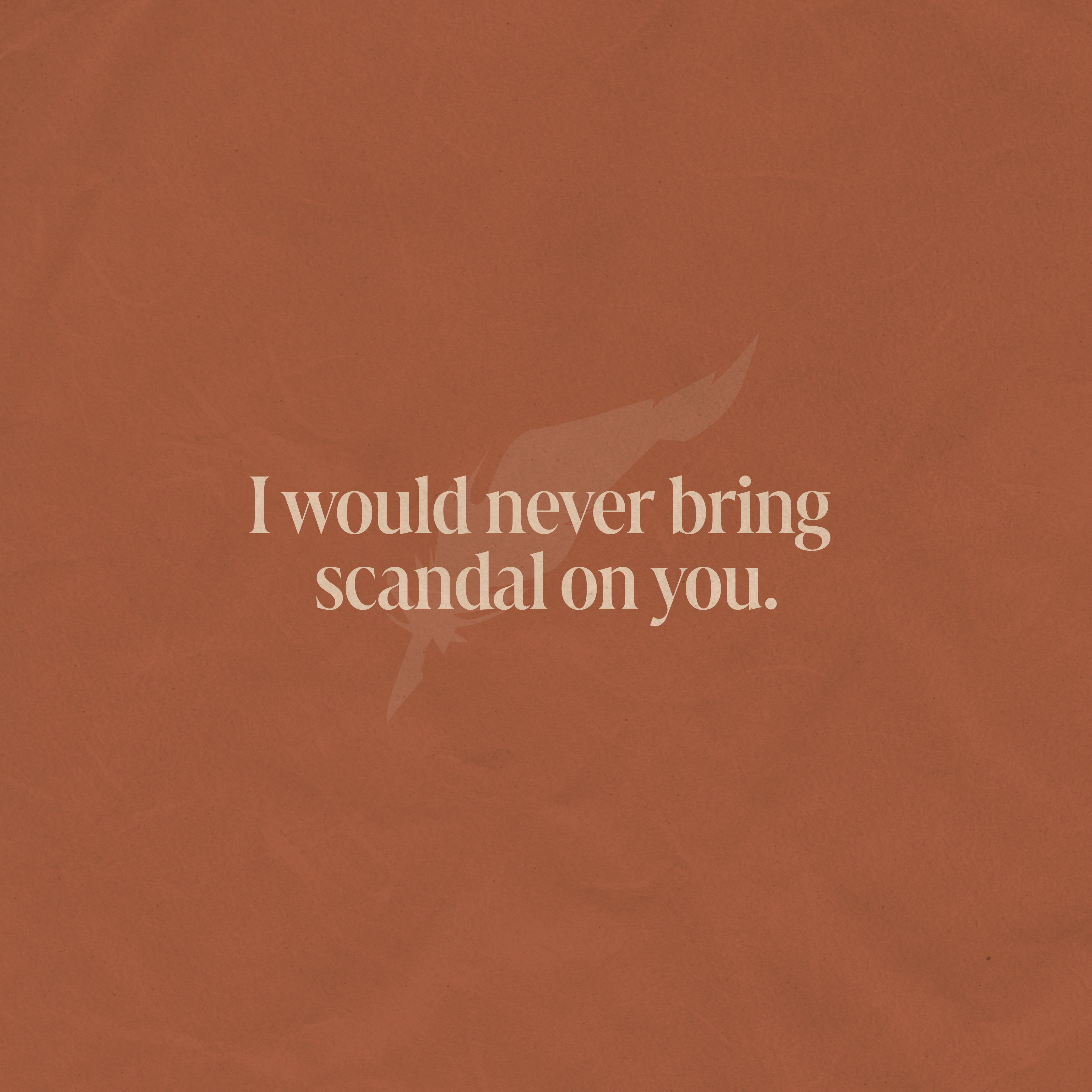
I chose a timeless font for Penelope’s logo and added a quill into her name (I love that a quill represents her name: Pen + a feather).
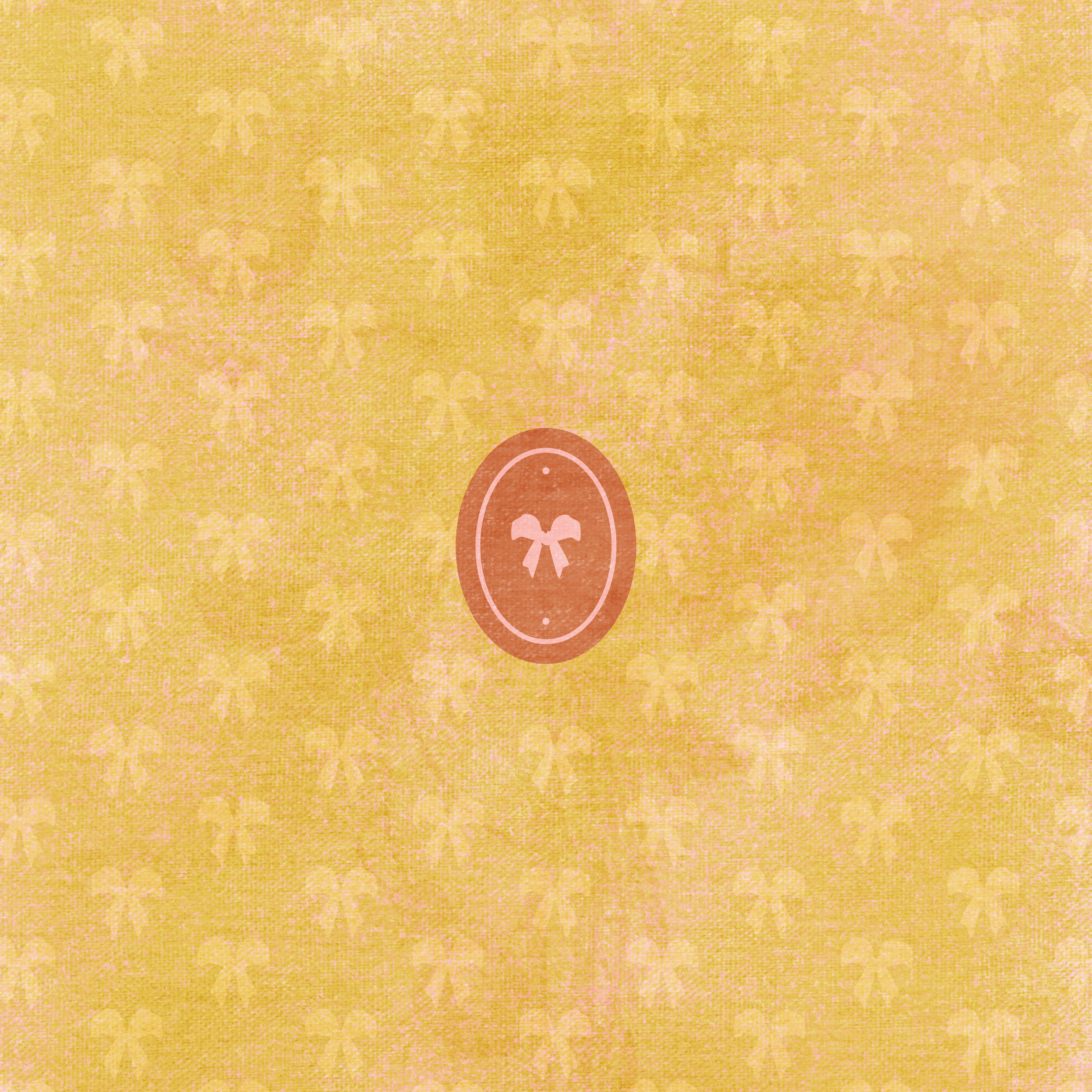
Penelope’s Brand Elements
I had to make sure her branding still showed off her fun, feminine, bubbly side, so I threw in a few elements like the bow and flower to make a few patterns. Colin also calls her “Pen,” and I think that deserved a shout out!
What do you think about our take on Penelope Featherington’s personal brand? Let us know on Instagram and stay tuned for more fake branding projects! It looks like Eloise Bridgerton is our next candidate.
Update: Eloise Bridgerton is up! Go check out her branding here.

How to Set Up a Pinterest for Business Account

About Lucky Bee Creative Studio
popular posts
Explore More
Personal Branding for Penelope Featherington

How to Create a Freebie Sequence with Mailchimp

Personal Branding for Camila Dunne from Daisy Jones

Bookstore Branding Design: Nook & Quill


