
Personal Branding for Eloise Bridgerton from Netflix’s Bridgerton
May 10, 2022
After designing a personal brand for Penelope Featherington last month, our Instagram audience voted to have us create one for Eloise Bridgerton, too!
For me, Eloise Bridgerton is one of those characters who you might love or hate. She definitely has flaws, but honestly I think problematic, chaotic characters are often the best kind.
If you’re unfamiliar with the show, I would describe Eloise as spunky, sassy, feminist, intelligent, and stubborn. All that being said, she is also somewhat immature. I wanted to make sure her branding showcased that she belonged to one of the wealthiest families in London (upscale), but it still gave off a feminist, somewhat-immature, vibe.
Here is our design process for Eloise Bridgerton:
Eloise Bridgerton Mood Board
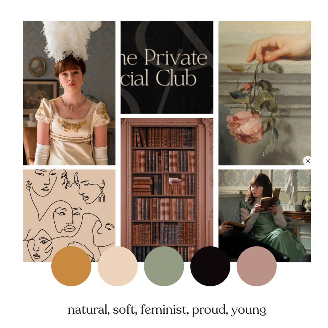
In Eloise’s mood board, I chose images that represented the following aesthetic:
- natural/earthy
- soft
- feminist
- proud/stubborn
- a little immature/young
I love the color palette that came out and decided to stick with it.
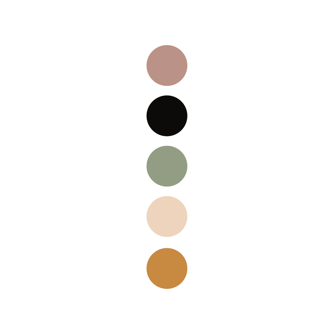
Eloise Bridgerton’s Brand Colors
I know a lot of designers may pick a type suite or design a logo first, but I’m always drawn to choose brand colors at the beginning of a design project. I think color can offer so much in terms of aesthetic and they really give a specific energy to a brand that a type suite can’t. Here, I wanted to use gold and black as they’re often associated with luxury and seriousness, but the tan, green, and purple feel more young and earthy. I have read interviews with the Bridgerton costume designer and know that the family clothing palette is intentionally more muted, so it made sense to reflect that.
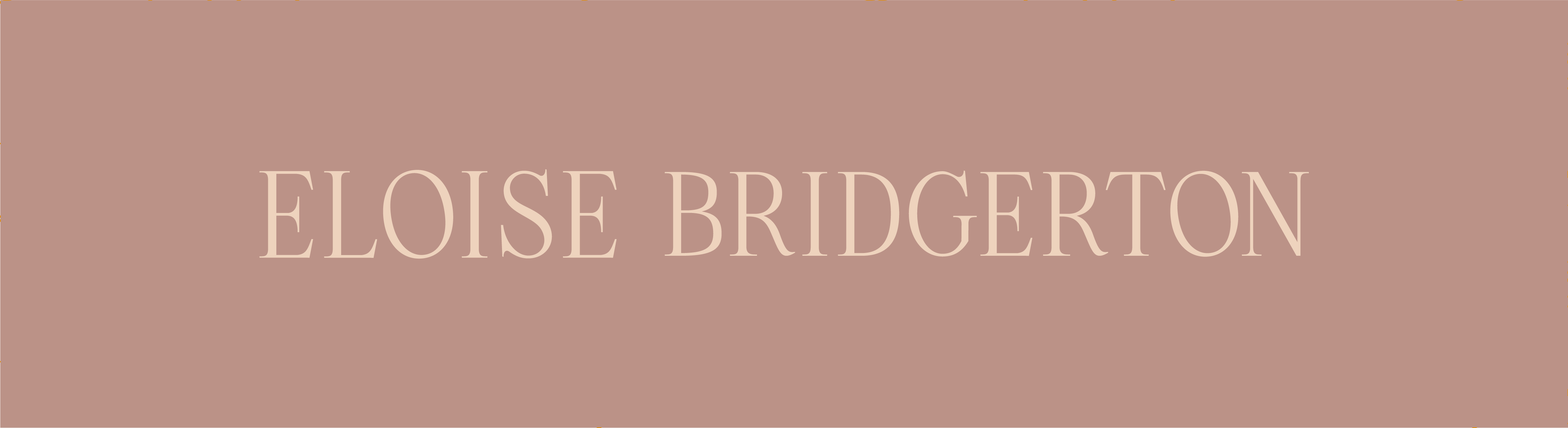
Eloise Bridgerton’s Logo Design
I chose a serif font for her logo as I felt it fit her time period well. Her main logo is intentionally in all caps because I felt like Eloise would want “to be taken seriously,” as a young feminist in early-1800s London. The font is elegant, but it still gives off vibes that she is young. The black and gold feel pretty bold to me, which also matches Eloise’s stubborn, somewhat dark, aura.


For one of her sub-logos, I included an illustration of a pile of books because Eloise’s favorite hobby is reading. I feel like she would use this secondary logo on her letterhead! 🙂
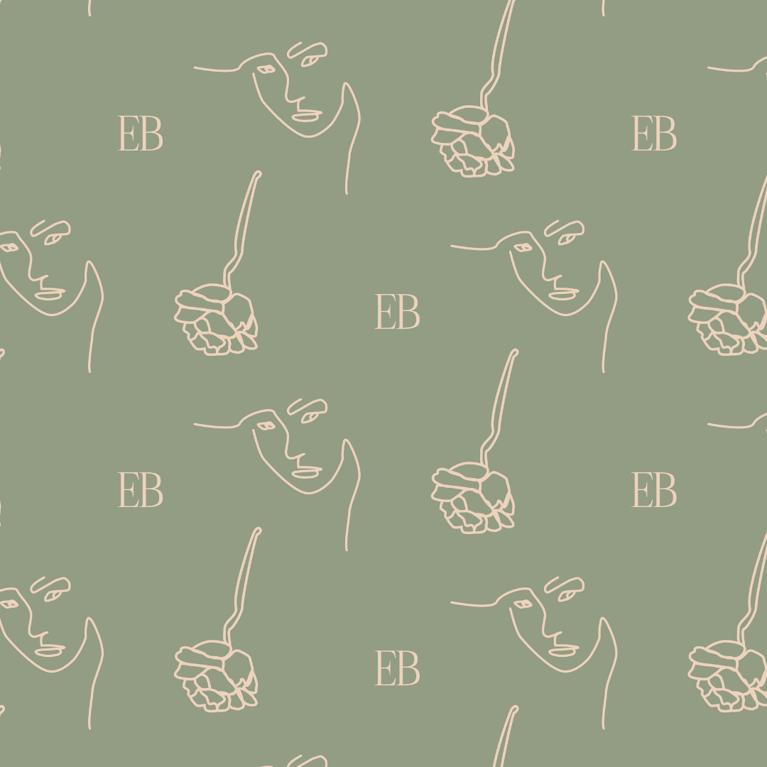
Eloise’s Branding Patterns & Icons
At Lucky Bee, we LOVE creating icons and patterns for branding suites. They can really make a brand come alive and are so unique! I created a simple pattern of a woman’s face, flower, and Eloise’s initials for Eloise. I’d like to imagine that Eloise could use these on things like book covers, handkerchiefs, on stationery, etc.
Eloise’s Social Templates
Since WE are in 2022, I also made a few quote templates for Instagram. You can really see the pattern come alive!
What do you think of Eloise’s personal branding design? Let us know on Instagram, and don’t forget to vote for your next Bridgerton character!

How to Set Up a Pinterest for Business Account

About Lucky Bee Creative Studio
popular posts
Explore More
Personal Branding for Penelope Featherington

How to Create a Freebie Sequence with Mailchimp

Personal Branding for Camila Dunne from Daisy Jones

Bookstore Branding Design: Nook & Quill


