
Bookstore Branding Design: Nook & Quill
April 24, 2024
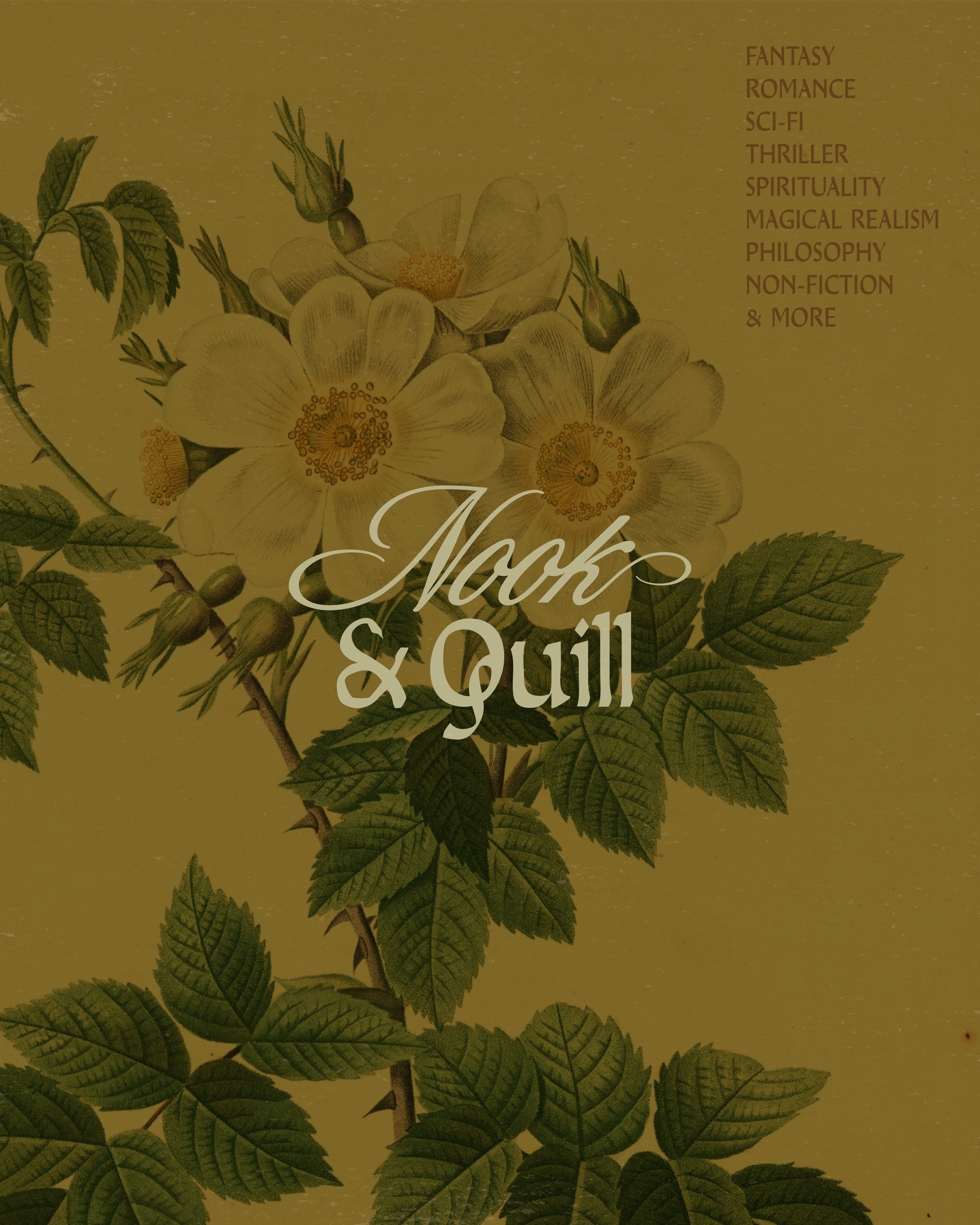
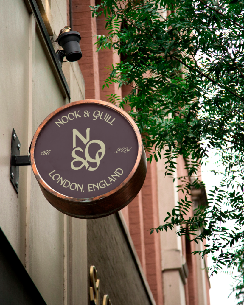
I recently completed a branding design for Nook & Quill, a moody, cozy bookstore.
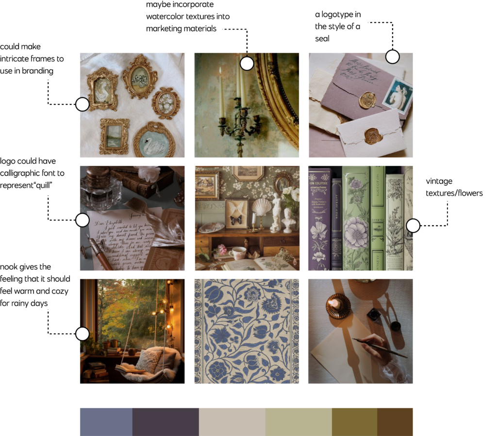
Before starting the design process, I always start with a mood board. This helps me determine brand direction as well as get ideas that will help the branding stand out. When thinking about branding design for Nook & Quill, I knew I wanted it to feel cozy (Nook feels like a spot you curl up in) and I also wanted to give it a vintage feel (quill feels older). I created the mood board below to outline several ideas I had—incorporating vintage texture into advertising materials, using a font for the logo that feels calligraphic, choosing colors that are on the moodier side, maybe using flowers in some of the advertising materials as a texture.
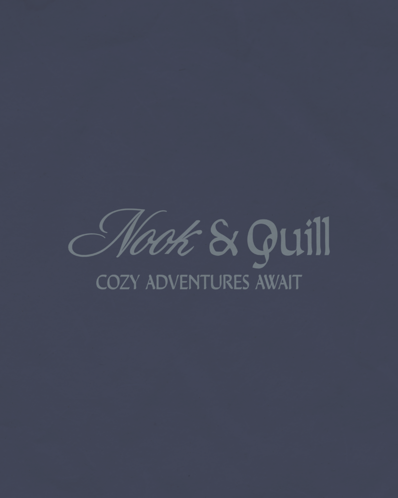
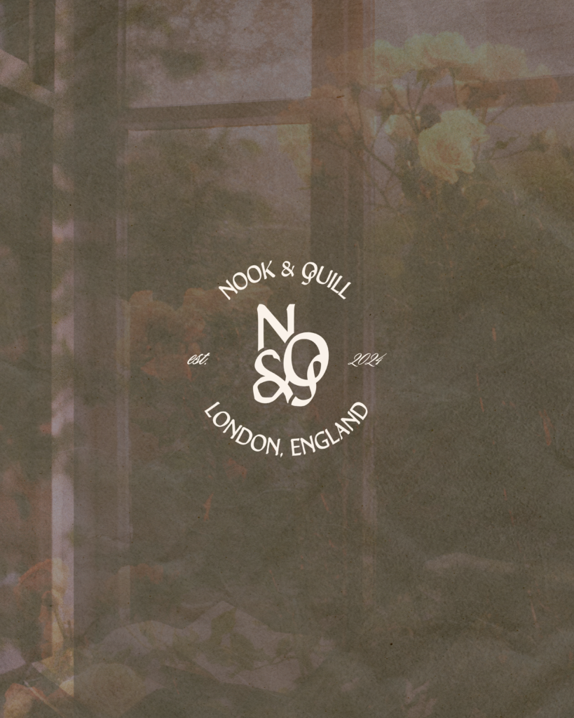
This helped me create the following branding design (type suite, color palette, and logo variations) for this bookstore. For the logo, I went with both a script font and serif—both of these have a vintage look that looks like someone could’ve written them with a quill. The ampersand also has a quill in the top.

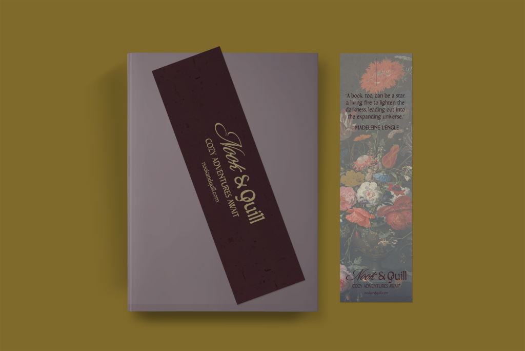
An example of a bookmark for Nook & Quill. Here I used a vintage flower texture I made—something I had considered with my mood board.
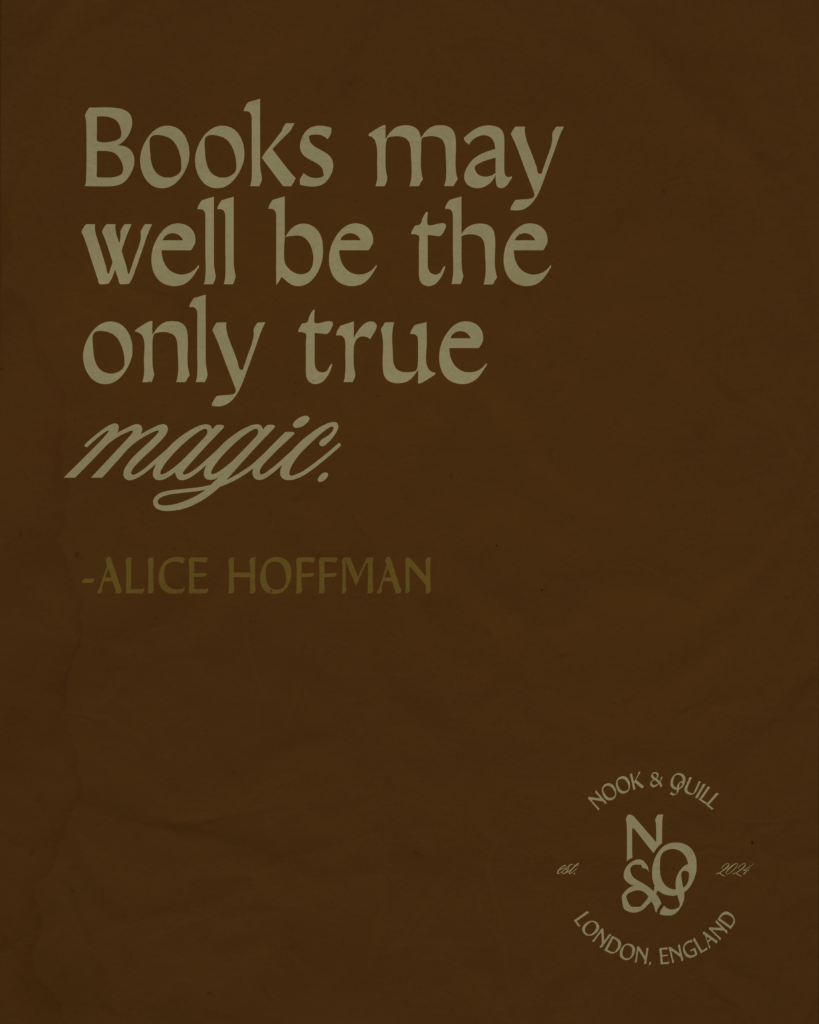
I choose colors that felt intense and dreamy—like you’re getting lost in a fantasy book.
This design brief was provided by Brief Club.

How to Set Up a Pinterest for Business Account

About Lucky Bee Creative Studio
popular posts
Explore More
Personal Branding for Penelope Featherington

How to Create a Freebie Sequence with Mailchimp

Personal Branding for Camila Dunne from Daisy Jones

Bookstore Branding Design: Nook & Quill


