Branding for Chelsea Photography

April 14, 2022
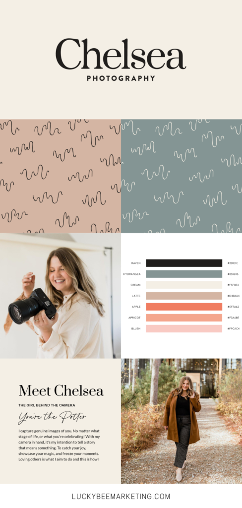
This year we had the pleasure of designing a brand refresh for Minnesota & Western Wisconsin Photographer, Chelsea Photography!
In case you didn’t know, Chels and I actually grew up together! We’re grandkids # 5 & 6 on my dad’s side. It wasn’t a surprise that she started a photography business as she always had her camera out, taking photos of all of us cousins at our grandparents’ cabin, Christmas, Easter, her birthday (lol), weddings, you name it. So thank you for all the Facebook photos and eventually wedding pics & branding photos for Lucky Bee, Chelsea!
Throughout her branding, we focused on these keywords:
- Fun
- Clean
- Elevated
- Genuine
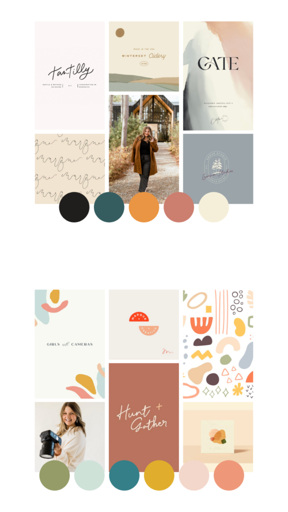
Chelsea Photography Mood Boards
When we first started working with Chelsea we presented her with two mood boards. She ultimately chose the first one, and we started pulling logo ideas and color palettes from there!

Chelsea’s New Logo
Chelsea wanted a new logo that was a little more modern and classic. She doesn’t really care for sans-serif fonts, so we took that into account!
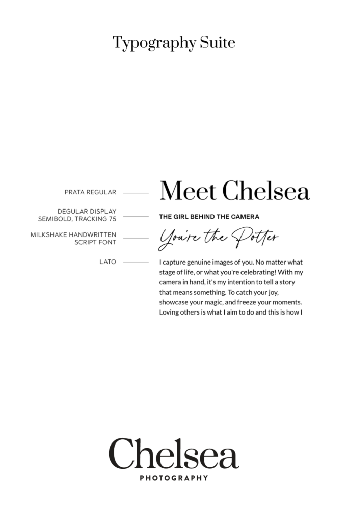
A New Type Suite
Chelsea said she didn’t care for thin sans-serif fonts, so we chose a thicker sans as her sub-head. Prata, the main headline font, is a timeless font that will look amazing as headers or in all caps. We also added a script font that she can use on occasion.
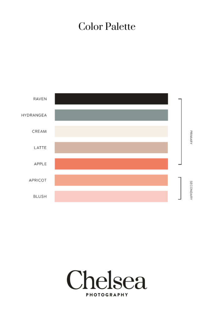
Chelsea Photography Branding Colors
We chose a new color palette that’s a little brighter than her previous one, but still has a luxury feel. It radiates Chelsea’s warmth and appeals to her clients, too.

Chelsea Branding Elements
Our design assistant, Nouchi, created line “squigglys” that represent camera reel. She can use these patterns throughout her website and on social media platforms like Instagram.

What did you think of Chelsea’s branding? Let us know on Instagram!
See more of our branding work here.