
3 Pro Canva Tips for a Beginner Designer

September 6, 2020
By Margarita Vinogradov
Many of us don’t have time to learn a new language—and when using Adobe programs such as Photoshop, Illustrator and InDesign, it can feel that way. How are you supposed to design and export a graphic, when it’s challenging to type a simple word like ‘hello?’
Among its many advantages, Canva can immediately feel less intimidating than Adobe programs. Both the free and premium versions offer a variety of elements easily accessible to even someone who started designing yesterday. Canva is especially useful for Pinterest pins, presentations and beautifully curated Instagram posts (think quotes and even informational posts). Overall, it’s pretty ideal.
If you’re thinking about designing graphics in Canva, here are three pro tips and tricks to help your design look polished, professional and pretty!
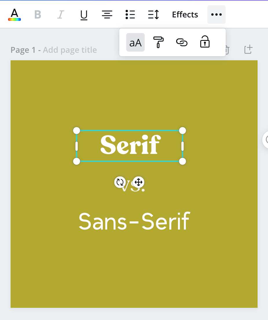
1. Incorporate both a serif and sans serif font into your design.
To begin, let me explain the difference between serif and sans serif. I can bet that you’ve seen these two font styles in action throughout your life, so there’s no need to feel intimidated. The classic Times New Roman font? That’s a Serif. Arial? Sans-Serif.
Have you figured it out? Take a peek at the ends of the letters. Notice how they’re different? Sans-serif doesn’t have notches, but serif does. See the image below:
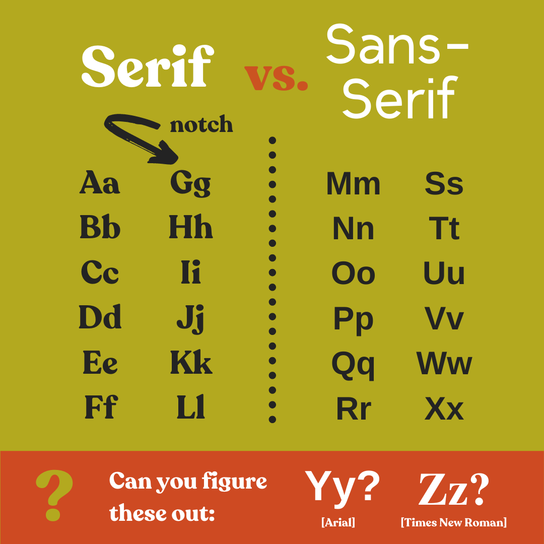
Traditionally, serif fonts are a little more formal while sans-serifs are seen as playful. Serif fonts are also much easier to read in large bodies of text, which is why you’ll normally see them used in books.
When you use both styles in your design, it will make your image visually interesting while establishing hierarchy.
It’s not necessarily intuitive, but if you flip through magazine layouts, they often follow this rule. I think it works well in (physically) smaller Canva layouts as well. Yes, not all designs call for this (many “modern” designs feature two sans-serif fonts instead) but sticking to this simple tip can really help you level-up your design game.
2. Use Your Grid
No matter if you are creating a classic 1080 x 1080 pixel Instagram post or a larger 1000 x 1500 pixel Pinterest pin, using the space on your page wisely is crucial to creating an appealing design and ultimately drawing in your audience. Of course, as a designer, this takes both practice and a level of creativity that comes with time.
Starting with a blank page can feel intimidating if you’re new to the design world, but Canva allows you to select pre-made templates that you can plug into and move around to fit your brand. Playing around with pre-existing designs will help you get a feel for what’s aesthetically pleasing.
Canva will also help with alignment. Each time you move an item or text box around, purple margins light up to allow you to align your elements in a tidy way. You can also align text boxes and other elements with the position button, located in the upper righthand corner of your browser.
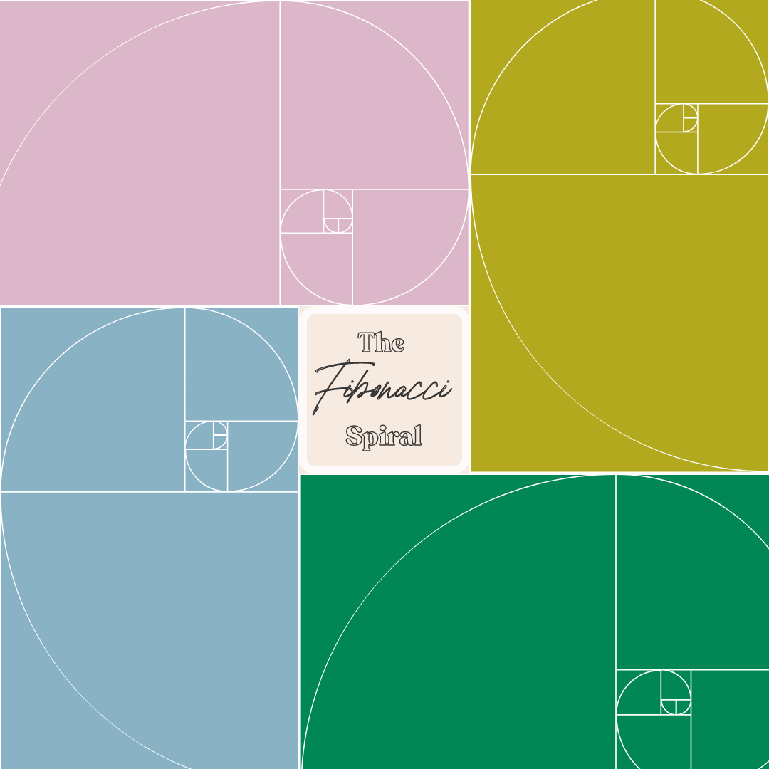
Another rule designers like to follow is the fibonacci spiral, which is found in nature (if you look closely, it resembles a shell). When you put most of the “weight” of your design (for example, bigger text) where that spiral falls, it often feels balanced.
When you’re starting out though, centering or aligning elements to left or right margins is a great place to start.
3. Don’t be afraid of ‘caps locking’ it!
The great thing about design is that there are no rules! Yes, a little counterintuitive as everything explained so far may seem like one (remember: these are guidelines), but following standard capitalization rules is not a requirement for anything you make on Canva or any design program for that matter.
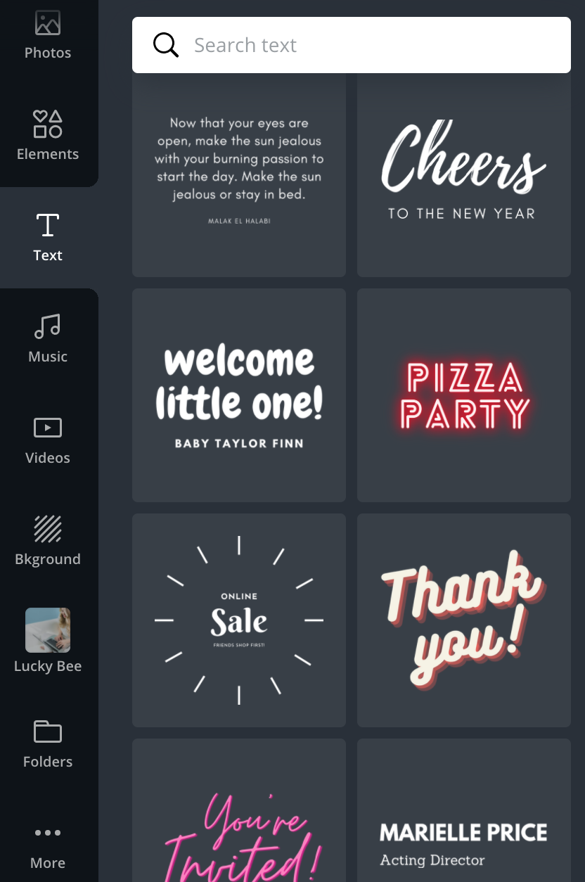
I like to think that the program even encourages designers to stray from this, offering a feature found under the dots which looks like “aA,” (see below) that allows you to see what your text box would look like with all capital letters.
You can find this in many programs, like Adobe InDesign or Adobe Illustrator, but Canva places this feature in a prominent location, which makes me think the software is trying to push you to get creative. Even when opening the “Text” menu on the left, you see that there is an option to use their premade font designs, many of which use all capitalized fonts.
Well…there you have it! Three tips to start designing in Canva. Again, these are merely suggestions, but I have found that when I am stuck in a rut, playing around with these in Canva helps me better imagine my final design.

How to Set Up a Pinterest for Business Account

About Lucky Bee Creative Studio
popular posts
Explore More
Personal Branding for Penelope Featherington

How to Create a Freebie Sequence with Mailchimp

Personal Branding for Camila Dunne from Daisy Jones

Bookstore Branding Design: Nook & Quill


