Personal Branding for Emily Cooper from Emily in Paris
September 13, 2024
I recently designed a personal brand for Emily Cooper from Emily in Paris in honor of the second part of season 4 coming out!
When designing Emily’s brand, I first put together this mood board:
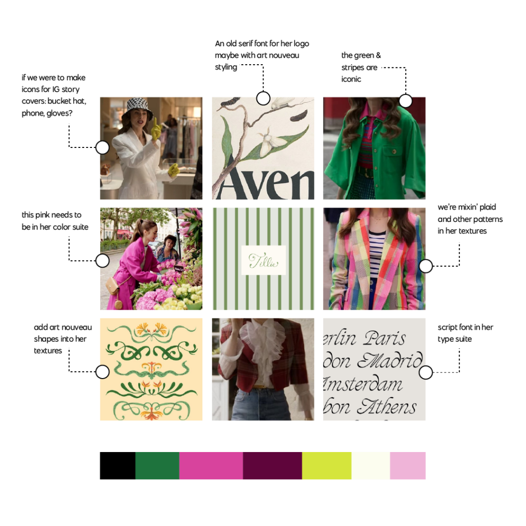
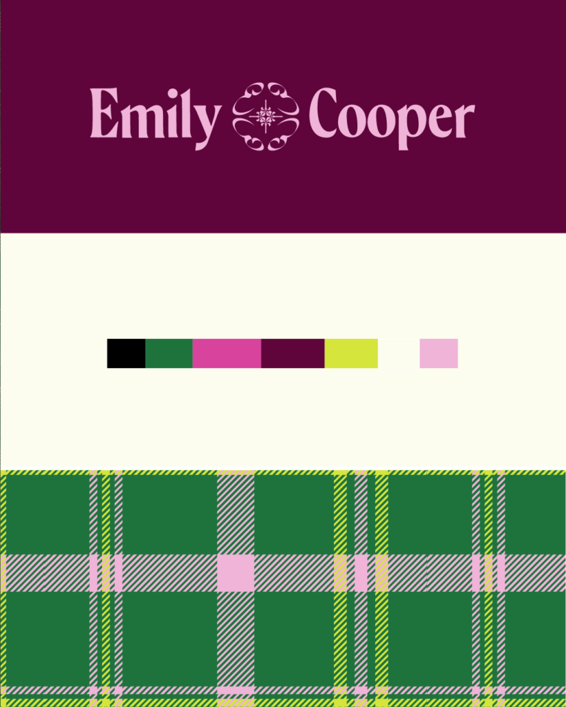
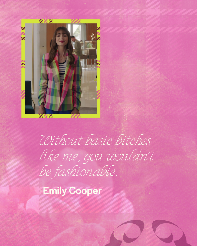
After looking at the clothes she wears on the show, I knew that I wanted a bright, bold, feminine color palette that could also feel a little preppy. She wears a lot of plaid on the show.
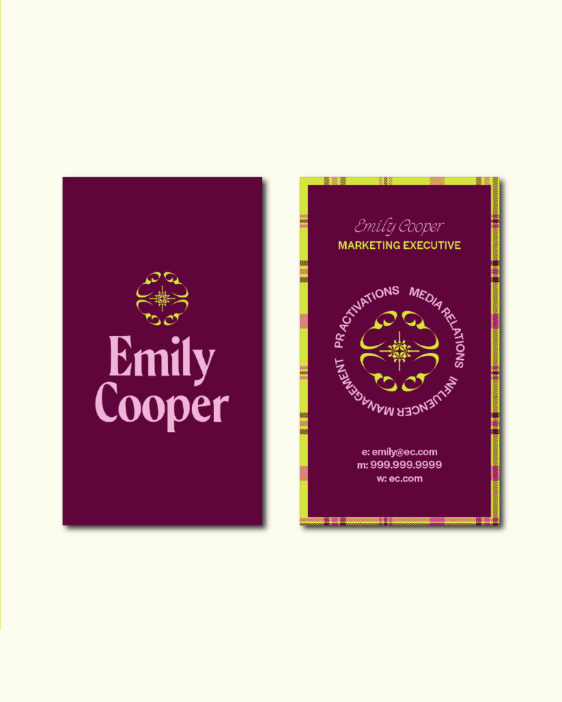
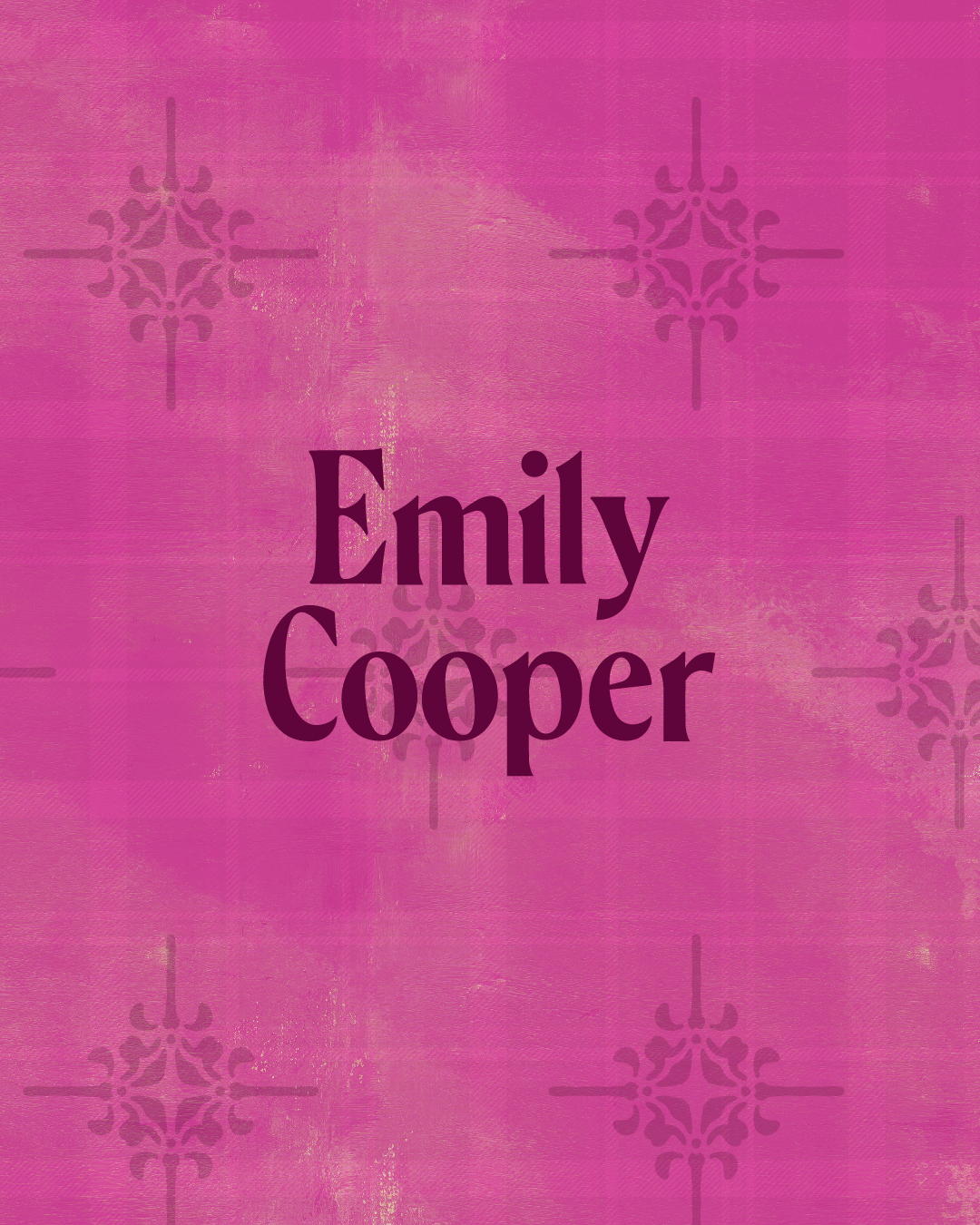
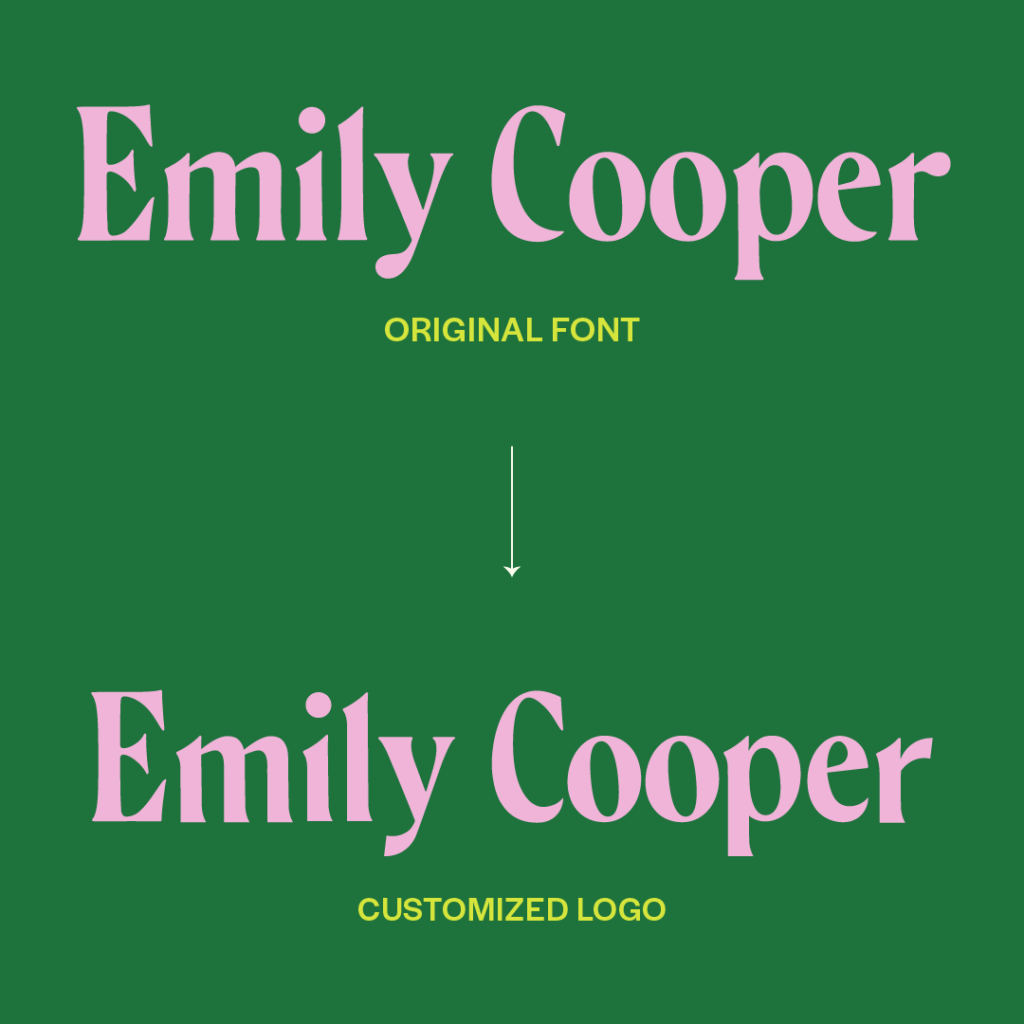
I also wanted her logo to have an art nouveau, old-style feel but also still modern and unique. I thought an Italian-style script font would make sense for her type suite.
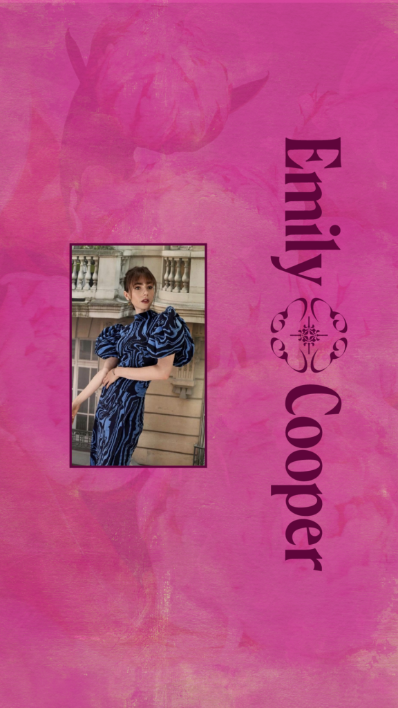
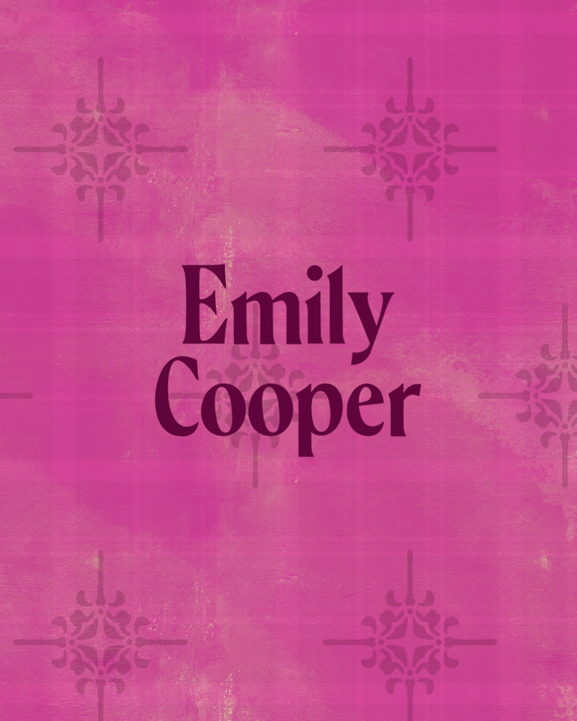
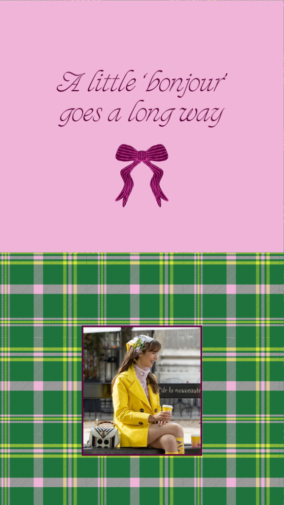
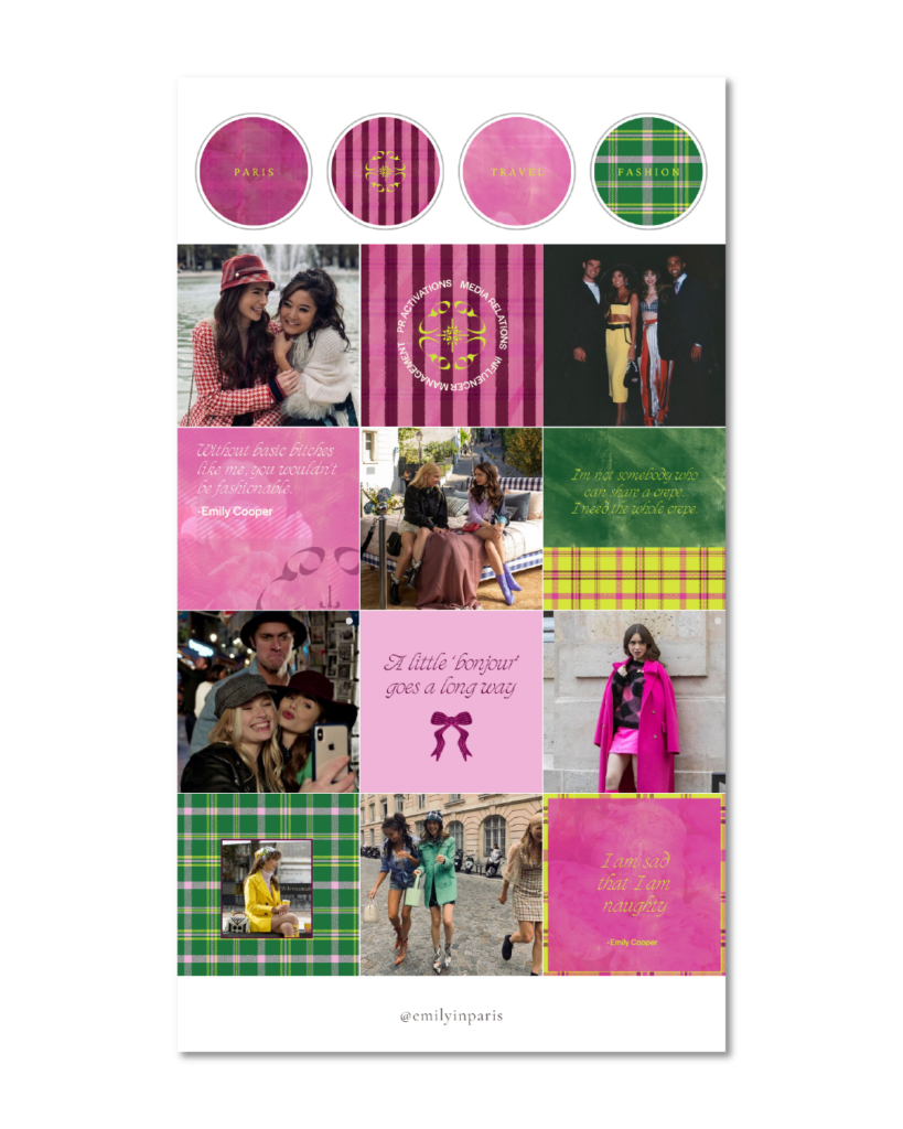
That let me to designing lots of textures that really felt like her: feminine, soft, with a preppy touch.


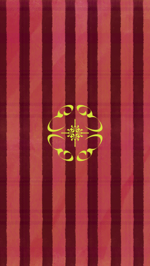
I also wanted her logo mark to be inspired by other popular designers like Balenciaga, Loewe, and Burberry.
Please enjoy Emily Cooper’s branding design and let me know if you would’ve done anything differently!
